Saturday 31 May 2014

Creating a frame structure for chapter pages

Since i had done my section pages i decided to go back to my chapter pages and create a structure for it as well as starting to add the content in. The reason i wanted a new structure to my chapter pages is because i wanted the user to be able to tell the difference between a chapter page and a section page, as i wanted to make them look different.

I initially wanted a similar concept to my section pages with an individual container for each area of content as well as using a background colour to place the content in a box frame. Looking back at my ibook i realised that i used a lot of the odd looking boxes to frame and contain a lot of my content in, and it made me realise i could do something similar to my website.


(examples of my iBook where i used the boxes to contain my content in)


The way in which i was thinking of being able to achieve this idea was to use the frame structure from my section pages and change the colour to the box colour from my ibook and then replace the skyline top part and use a rugged scrappy look, similar to the box top from the ibook, and then use a bottom part as well and have it place under the container so it would look like the box from that i used in my ibook but just stretched with max width.

This is how it looks like on a couple of the chapter pages as i haven't officially added the content in yet, the text and video is just something i randomly used so i could have content in there for the time being so i could see what the container looked like.


From this style for all of the chapter pages, i will have multiple boxes in order to contain my information. I will most likely use two to three boxes per chapter page as i don't want to have too much content for more of the introduction to the chapter on a whole. 


Something i also i added to fit the theme of the rest of my section pages, is by adding an arrow with text, which i feel like is a cute touch and informs the user well about looking for more content and knowing where to go to get it.


Friday 30 May 2014

Finishing section pages!

After spending a lot of time getting the structure sorted out and placing in all the content in, and making the overall presentation a layout looking nice, i've finally been able to get my section pages finished!

Getting these pages done did take some time and it was very time consuming to get the right structure for these pages, however once i sorted out all the structure for one of my section pages it was easy to do it for the rest of them.

Some pages within the sections had more content than others, and some had sliders and there were a few problems i encountered when placing the content in at times or getting the slider to work the way i wanted it to work and look.  Despite all of the section pages are done.

I will if i have time go back and add things to certain pages or remove things or change particular things about certain aspects of those pages, but for now i'm happy how they look and the fact that i've got them done, now its time to work on my chapter introduction pages!

Making things simpler

When putting some content on my pages there were instances where i was placing the content in and was adding text underneath a image for example but because i didn't have a lot of text content for particular bits of content i felt that using mainly 8 columns wouldn't work unless i either added more text content or got rid of the text content.


The page i'm referring to is the safety page within the sections on my safety chapter and when i was adding the supply images of 'what you need for an earthquake' i realised it wouldn't work by adding text as there was very little of it for each supply and because the information i had originally wanted to use was obvious on what it was or how to use one of the supplies i decided to make it easier on myself and make it simpler by just using the images and having a comment with an arrow above to point out that they are supplies that are needed incase of an earthquake.


Overall i think it makes the layout more comfortable and i feel added text would have ruined it and the titles underneath the image speak for themselves so its more obvious to the user what images they are and because using them or getting these supplies is general knowledge i felt that added text really wouldn't have been needed.


Also for another page of mine and in the same chapter i.e. 'common places' section page i was originally going to have a continent per column with the image at the side at the text on the other side but as i was doing this i realised i didn't have as much text content as i thought so i decided to simplify it by adding all the places on a four column grid to make the text fit with the size of the screen and images and i think it looks better this way.


Also when i was working on the 'safety' page, i was originally going to add before, during and after section but because i added a lot of text for that in my ibook i realised that on the website the content of it would make it look messy and overwhelming, so i decided only to add the '3 step rule' because it would make the layout more neater and overall not overwhelm the user with text which is what i wanted to avoid doing, so i could give the user a better experience when using my site.

Adding slideshows

For some of my pages i wanted to use an image slider and i was able to find one on a website called 'code drops' and it allows up to 5 pictures to be in this slider and be able to click from one to another.


There was a download which included the css and html as well as the javascript that needed to be added. The only things i had to change were the colours for the backgrounds in-between each slide as well as the actual images that the slider was linked to in the html. So basically all i had to do was copy and paste the slider html and css in my css and html documents and make a few adjustments according to what i wanted.

The page i used this slideshow was on 'overcoming earthquake' in the japan chapter and below is what it looks like. I made all the images the same width and height so the images looked more neater.


I also used a slider for the 'safety' page in chapter 3 and for this i got rid of some of the html where it had the div class of buttons and got rid of two of them since i only wanted 3 slides and then i changed some of the css slider stuff so it would work with 3 slides. I also changed the background colour to match the background image colour so it would look like it was one image within the slider.


Something i realised is in the smaller formats the slider was harder to see, so i replaced the slider with an image which displayed the 3 steps of what to do when an earthquake occurs. This makes it easy on the user when they are using smaller platforms and allows them to view this area without any problems.


Thursday 29 May 2014

Adding in extra content

On some of my pages i've decided to add a little bit of extra content, and in some cases it was because i wanted the layout of certain pages to look more structured or neater.

In other cases i wanted to add or split up content so i could add in extra images or so the page would feel like it had more content and it wasn't as empty or a waste of a page, and i did this for a few of my pages. For example below is a screenshot of my 'tectonic plates' page and i added extra images and text alongside that because i felt that for the website there wasn't enough content on this topic, so i thought of a good way to add more content as well as linking it in with text and then did so and placed it so the page looked more fuller with content.


However in other cases i added more content in because something on a page felt missing or the structure of the  page wasn't complete. For example in my 'impact' section i placed images on a eight column grid with information underneath. However i had an odd amount of images and for some reason placing 3 images on a six column grid wouldn't work so i wanted to stay with the 8 columns but that meant at the bottom there was a missing space.

I decided to add in an extra 'impact' which was water and made some graphics and came up with some text which i already had from the previous project which i added as an attachment to electricity and made it, its own separate thing so i could have even number of content on the column grid.

Adding Videos / Arrows

After getting my main structure in my section pages and beginning to add content for the pages, for some of them i wanted to use videos and for some reason i couldn't get the whole copy and paste <iframe> from places like vimeo and youtube to work. Because of this i decided to have local videos where they would be sourced from my website folder, and to do this i needed the videos.

When i was trying to find a video downloader i came across a software called 'Apowesoft video downloader' and this is a downloader that can work by adding in the url for vimeo videos or youtube videos and you can download it and have it convert into a HD video.


This was a great and easy way to get the videos that i wanted in my website, and for my code for one of the videos for example, it looked like this below.


This piece of code would allow it to be automatically responsive, which is what i wanted, and every time i used the downloader all i would have to do would be to place the video in my main website folder, and in this case i placed in my images folder to make it easier for me and then place the code in and it would work, see for yourself below!


Something i've also added recently my site is arrows, now i've made these images with a bit of small text above and used it to point out certain aspects within my site, like that what an image is or what a video is about, and i've done this to make my website more interesting and quirky. I like it as it makes the site more fun and points out things to user that they might not be sure about so it helps to keep them informed and that's why i like it!


I've used this arrow element throughout my website in certain cases, in order to make the website fit as one and make the website seem a little bit more funner and enjoyable as well as keeping the user informed on certain elements of the website. Below is a few examples


Sunday 25 May 2014

Some issues and getting back on track

When i came back from Barcelona i had thought that everything would be fine and i would be able to get back into my site, however i ran into a few issues. When i began working on my chapter introduction page i realised that i hadn't been working according to the column system that skeleton uses to run and i feel into a lot of issues because of this.


I was struggling to put contention because they weren't in columns and every thing i added to the css or html would push or move another piece of content so i was struggling to understand why this was happening and felt like this project was going to be impossible. However when i showed my html to my teacher they picked up on that i hadn't been using the columns which i had totally forgot about and that was why places assets to my page was nearly impossible.

My teacher made it clearer to me about the grid system and i then tried to re-start working on my pages, and because the one chapter page looked a mess i decided to work on one of my section pages which was the 'outcomes' page.


I started by adding a sixteen column for my header image and after i two eight columns for images and text for the primary outcomes, and after i did that i added four, four columns for my other content which was my secondary outcomes.


After trying to get my headers to work, i gave up with them as i tried using google fonts and font squirrel and i couldn't get the font i wanted, so i ended up resulting in using images which i know is a big no no but i just wanted to do it quickly and use the font i wanted without any hassle or issues.

Once I had got all my content looking nice i then decided i wanted to frame it, so i decided to add extra containers for each bunch of content and it led me to be able to have framed boxes for my primary and secondary outcomes. I also added a skyline image at the top to sit nicely on top of the first box to give that sense of an earthquakes and tectonic plates.


As i did that i realised when it got smaller on the screen you couldn't see the skyline that well so i decided to replace the image with another with a pointer thing so it would look more visually appealing on a smaller device and so it would work well with the header at the top of the screen.


So that's pretty much it for this page and i will be using this frame for the majority of my section pages, now its just about changing some of the columns and adding the content in, so i will be working on the sections and then go back to the chapter introductions and create a frame for that and then add the content in for those pages, then after all that my website should be done!


Saturday 24 May 2014

Starting to build my site (Homepage)

Before most of us were going to Barcelona, i wanted to get started on my website, so i could feel happy leaving for Barcelona, knowing that i had done some work for my site and so i could come back to my site and continue with it.

So to begin with since we had to use columns for our main way of creating the site i began with the navigation button (home), since it was going to be at the top of the page and i wanted to work my way down. I began by adding the code in shown below, so that i could i could have it appear on the page and also so that the image would be a link.


This above is what the page looked like with the navigation, and also i added a background colour as well. After adding the basic code in, i then wanted to create an image swap and the way i did this was naturally to youtube and google it and i managed to find a handy video, which is an easy and simple way to hand code some javascript, in order to create an image swap navigation. Below is the video i used to help guide be through the process of this task.


After following this process i ended up with code like this below, and because this person only used one example of an image swap instead of multiple ones as i wanted other navigation buttons to display i had to rename most of my 'imgOver' and 'imgOut' tags to 'imgOverr' 'imgOutt' for example so that it would still work and be able to work for multiple navigation buttons as well.


I used this process for my other navigation which i'll talk about later, but all i had to do to get it to work with multiple image links is just to slightly change the tags as i mentioned above. After using that tutorial i was able to get my home navigation working, so when you hover over it, it lights up as well as grows slightly downwards so its more obvious to the user that they are hovering over the element and know whether they want to click it or not.


                                                             not over                                  over


After sorting out my home navigation i then started to get my logo up on the main homepage and i began by adding the essential code with the <img> tag as well as the <a> tag so that i could link the logo and i would have it link to home as well. Essentially there are two home buttons the main and more obvious one and the logo so its more convent for the user. The code i added for the logo was this. 


The reason i added a width and a height of this is because i wanted to make the top of the main page simple with the hove nav and the logo quite large so it would be engaging and more eye-catching than having a small logo and a bunch of content near it.  I also gave the sixteen columns and extra class with 'logo_holder' and i used this so i could give more space for the logo to breath and centre nicely without any content underneath to pop up, as i wanted it spaced out nicely.

Here is the css i used for the logo and logo holder to get it where it is. 


And this is how it looks, which i was very pleased with when i achieved this!


This is how it looked when smaller, and the way i did this to make the logo shrink was add some css code, shown below, and this code helps to shrink the cogent according to when the screen size shrinks.


Once i had my home navigation and my logo i then was ready to start creating my main navigation for the pages where my content would be placed. I started by doing all the link coding and image coding and then went to use javascript to create the image swap, like i did before with my home navigation, so it was an easy process, and for the boxes to sit on the columns i create two eight column grids for the buttons to sit nicely where i wanted them, and then i added a 'text-align:center' in the css so it would sit nicely in the middle of the screen.


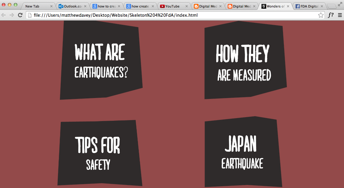
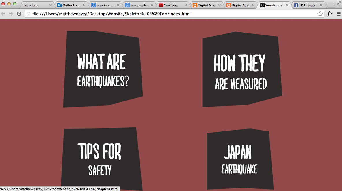
When you hover over one of this image links it will decrease slightly in size, and this was a way to keep the interactivity slightly more fun and engaging and more obvious to the user what they are hovering over to give them the best user experience possible. The navigation also does shrink move with the screen when the screen decreases, and it pushes the content so it can fit. The reason why this works is because of the column grid which the content sits on and automatically pushes the content so  it can fit on any scale.


Above to left the tablet size and the right is the mobile size and i'm so pleased when i got this to work, i'm starting to get used to the skeleton column grid system!


After i was able to get this all working i then added the 'crack' image i wanted, which was to fit in the middle of the navigation. i added some code within the css after giving the image a class. Once i got it to work i then went to the layout.css to make the image display none on all of the other platforms apart from the desktop, because i knew the image wouldn't work and it would be hard to incorporate it into the smaller devices.  So below is how it looks on desktop!


I was so pleased with my efforts at this point and was hyped to continue as i felt i was getting better. After finishing my main homepage i then began creating pages and linking them for my chapters and then creating section pages and adding the basics like background colour etc. After i had done that it was time for Barcelona.