Monday 31 March 2014

Typeface (Forgot to add earlier!)

Something That i forgot to cover within my iBook was the typeface and fonts I decided to choose. In my iBook I wanted to use a couple of fonts, one representing the title of the book, another for the headings in my iBook and then my main body text. Because my iBook visual style and the way i designed it was quite simple with the use of flat design and colours I didn't really want to use boring fonts or overwhelming fonts.

Firstly for my main font for the title of the book i wanted to use a san serif font because I didn't want to make the iBook feel or look formal as this iBook is supposed to be targeted at a younger audience i.e. students, so I wanted to make informal and looking exciting. The type of font I wanted was a distorted font which compliments the whole topic of earthquakes and fits in well with that topic. I looked over the internet and found I font called 'Earthshake' on Dafont.


Fig 1 - 'Earthshake' font 

Link: http://www.dafont.com/earthshake.font

As you can see above is the font 'Earthshake' and I went for this font as my main title font because it looks destructive and has that essence of something is destroyed or damaged and to me looked very much like an earthquake type of font. I experimented with it when making my front cover of my iBook and this is what the font looked like on the title page below.


Fig 2 - iBook front cover

Above is the front cover i made for my iBook and I am very pleased with the style of it and the overall look of the cover and I would expect if someone saw this on the iBooks store it would catch their attention and make a good impression on who would look at it. With the front I used it for the title of the front cover and split the word up in two and placed 'Earth' above and 'Quake' below as if they are resting between the two plates under the earth, and I think that this works really well as it relates a lot to earthquakes and the tectonic plates and visually looks simply but engaging and the text of the title is visually engaging and relates to the topic of the iBook.


For my other fonts the body text I decided to use 'Helvetica' because its one of the most common and readable font types and isn't too overwhelming or out of place which is the reason why I chose that font type for my main body text in my iBook. As for the headings of my iBook I decided that again I wanted to use a san serif and I wanted to use a more simplistic font type that worked with my visual style of my iBook. For my presentation I did on this topic I already used a font type I had and it was called 'Mari&David' and when I was thinking of fonts to use for the headings of my iBook this font sprang to mind as its very simplistic and is a san serif and could potentially work well with my style of my iBook.


             Fig 3 - 'Mari&David' font                                          Fig 4 - Example of iBook with font 


Link: http://www.dafont.com/mari-david.font

Here above in Fig 3 is what the font looks like that I decided to use for my headings in my iBook for earthquakes. The appearance of the font is quite simplistic and not too overwhelming and are a couple reasons why I decided to choose this font for my headings in my iBook. The bold version of the font stands out and is noticeable and would help to indicate what each page of mine are etc. The font almost looks handwritten and in a sense quite scruffy because it looks handwritten, so it kinda relates to the theme of earthquakes because create mess and make areas look messy and scruffy so this font works well with the topic and my visual style.

Overall I'm happy with my font choices and create a great impact for my iBook which works well with the visual style and topic of my iBook of earthquakes. My main font has a great feel and look of earthquakes and my headings create a simplistic and visually appealing look which helps to make my iBook look structured and not overwhelming or too messy and dramatic on each of the pages.

Wednesday 26 March 2014

Crit and Feedback

The other day our class presented our iBooks so far to the rest of the class, even though many of them weren't finished. I was able to present mine and the majority of the content and progress for my iBook was nearly complete, just a few things that I needed to add and tweak but not much.

The reason why I was more prepared than others despite not having a Mac at home is because I came in during Friday and Monday to get more work done for my iBook as I was worried that I might not get the project finished in time. Having came in helped me to have about 80% of my iBook complete which i'm happy about.

When I critted to the class I went through basically all of my iBook discussing he content, chapters, sections etc and what interactions there were. After doing so I got some very positive feedback rom both the class and out teacher. Most people said they liked my visual style and it works well with my topic of earthquakes for this project.

A lot of people liked the way I laid out my content and how I had some good flat graphics for interactivity for the user when they use this iBook. The all admired ho much effort and work I put in as well as the overall iBook on a whole. I did get a few critiques, for example someone pointed out in a couple of my pages where there where clickable graphics some pages said 'click to get info' but other pages didn't. I understand that maybe the user might not initially think to click on the graphics if it doesn't say you can, so i'm going to add some text pointing this out that the user can click the graphics to get popover info.

Overall I was pleased with the positive feedback and how everyone liked my visual style and the way its presented through each of the pages. I originally thought some people might have said my work was to text heavy even though it there was only a few pages with a few blocks of text. At the moment I will continue to work on my iBook to improve it based on the feedback and make sure that my iBook is better than when I presented it to the class the other day.

Some Changes

With the crit of our iBooks coming up there were a few pages I was unsure with, with the appearance and I wanted to make these changes before I presented to the class my iBook in its current stage as I knew people would comment on the pages that weren't as visually engaging or looked slightly messy.

The pages I wasn't happy with within Chapter 3: Being safe in Section 4: Before/During/After. The reason why I didn't like the look of it was because the bullet points looked messy and spread out in a unstructured way. 


Fig 1 and 2 (Chapter 3 Section 4 - Before/During/After)

What I wanted to do was make it look more organised and less sloppy so I decided to store the information of 'Before 'During' and 'After' in a large popover which gives you information what to do. I felt this way was a lot more visually pleasing in the layout and was more interactive for the user. 


Fig 3, 4, 5 (Chapter 3 Section 4 - Before/During/After)

For the boxes I created them in illustrator and gave 'During' and 'After' boxes a crack effect to represent the damage from the earthquake and I think it helps to define the boxes really well. 


Fig 6 and 7 (Chapter 3 Section 4 - Before/During/After) - Supplies needed

Something That I also added was a page which presents the supplies that are needed for an earthquake. These graphics I made in Illustrator and all are pop overs which gives some information about why they are needed for an earthquake. The layout of this page is simple but effective and gives a good use of interactivity to the user, where they can find out information on what supplies are needed.


Fig 8 (Chapter 3 Section 1 - Common places)

Originally I just had a block of text and some pop over graphics of continents that have earthquakes on a regular basis. After testing it on the iPad I thought of the idea of mainly have a bunch on continents that are pop overs that give information on the earthquake rate there. I decided to choose a couple with a background under the continent in order for it to stand out more and fit with my theme of my iBook. I did add a scrolling information box which summarises what places are common with earthquake encounters.

Monday 24 March 2014

Testing iBook (Chapter 4)

After testing chapter 3 I then went onto test chapter 4 which is to do with Japan's earthquake in 2011. The reason I originally wanted to include this earthquake in particular is because it was an earthquake that happened a couple of years ago and had some big impact on the country, and led to other bad outcomes i.e. tsunami, aftershocks, economy, nuclear disaster etc. This earthquake was also the 5th strongest of all time and is the strongest that's ever hit Japan. 


Fig 1 (Chapter 4 - Introduction)

Above in Fig 1 is a screen shot of the beginning of chapter 4 with a little insight to the earthquake and the magnitude and other information. There is also a video on the right which has real footage from CCTV camera's through a time lapse of the day of environments of Japan and how bad it was hit by the earthquake/tsunami. The video is devastating and would most defiantly shock the user when watching it and I feel like its a good introduction to the chapter giving an idea of how bad the earthquake and tsunami was.


Fig 2 (Chapter 4 - Introductory video) 

In the screen shot above in Fig 4 is an introductory video on Japan's earthquake which is a time lapse showing the earth vibration activity before and during and after the massive earthquake and it is mind blowing. This video is a great way to get a view from the map of what it would look like and it is really shocking. This is a great other video to give the user the option of watching and it helps to give more insight to the strength of the earthquake and tsunami.


Fig 3 (Chapter 4 - Section 1 What caused the earthquake) 

Fig 3 presents a screen shot from the first section of chapter 1 which talks about what actually caused the earthquake, not just the tectonic plates but slightly more in depth and also a gallery at the right presents visuals of the way the tsunami came about. The information talks not only about how the earthquake was caused but also the tsunami. For the information I decided to put it in a scrolling box instead of just placing the text on the page which would make it look messy and intimidating.


Fig 4 (Chapter 4 - Section 2 Impact) 

In Fig 4 presents the next section which is the second section. This section is to do with the impact the earthquake and tsunami had. The way I decided to present the information was through pop over images which represent the type of impact. The impacts included costs, nuclear disaster, deaths, homeless, destroyed buildings etc. I love the way this page works as I love the graphics and cute symbol icons I created which creates a good amount of interactivity when it comes to receiving information. I decided to have pop overs as I felt I had a lot of information for this section and didn't want to make it too long or too text heavy and I felt like this was a good way to create a good amount of interactivity for the user and a good way to store information and make the page visually appealing also.


Fig 5 and 6 (Chapter 4 - Section 3 Overcoming the earthquake) 

In Fig 5 and 6 are screen shots from the third section within chapter 4 which is to do with how Japan overcame the earthquake. This page talks about the government and how Japanese people weren't getting the support they deserved from their own country. I added a gallery at the left in order to give the user some interaction with the imagery and an idea of what people were going through at the time. In Fig 6 presents the gallery if you click on it, it will zoom in a focus on the images.


Fig 7 (Chapter 4 - Section 3 Overcoming the earthquake - Support) 

After the section to do with how Japan tired to overcome the earthquake and the lack of support from the government I then added an extra page of a few  examples of support they got from other countries. I did this by picking a few generic countries and a couple random ones and made them into pop overs. The pop overs display how much money they donated to Japan. This is a god insight to some countries support and how much they contributed. It makes you realise how supportive and loving our world is. 


Fig 8 and 9 (Chapter 4 - Section 3 Overcoming the earthquake - Damage/ Reconstruction) 

Within section 3 there is also a page which presents a few interactive images which allow the user to click on and slide them to see the damages of the earthquake and how its repaired many areas in Japan after 11 months after the earthquake and tsunami hit Japan. This gives a good use of interactivity to the user and allows them to see the mess the earthquake and tsunami caused and how Japan have been able to repair their country.


Fig 10 (Chapter 4 - Section 4 Someone's Experience) 

At the end of this Chapter in Fig 10 shows the forth section of the final chapter which presents someones experience through the use of an interview. I decided that I had a lot of information with this section and decided to only pick one person's experience and also to contain the information in scrolling boxes with a question per box to help divide the content easier and make it more easier to follow through and read about this person and their experience.


So far after testing all my chapters for my iBook I am very happy with the majority of all of it, from the interactivity to the navigation to the visual style and layout. There are a couple of changes that need to be made for some pages and I will update my blog when I make those changes.

Testing iBook (Chapter 3)

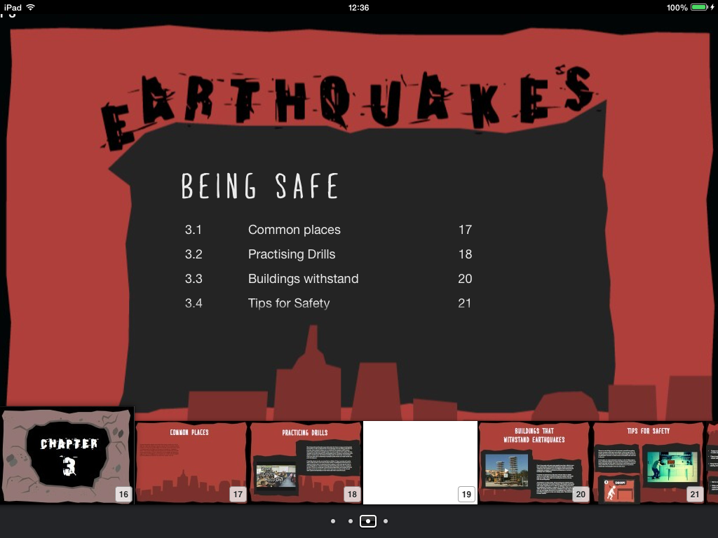
After testing chapter 2 I then went onto testing chapter 3 of my iBook at its current stage of development on the iPad. This chapter i tested is to do with people being safe from earthquakes where it contains information about common places of earthquakes as well as people who have to practice drills for earthquakes as well as buildings that can withstand earthquakes and also tips on before, during and after earthquakes and what do to.


Fig 1 (Chapter 3 - Section 1 common places for earthquakes)

Above in Fig 1 is a screen shot from the first section within chapter 3 which displays information about the common places of earthquakes. With extra information about Japan and California about the amount of earthquakes they get a year etc. I feel like this page has some decent and good information but I'm still unsure about the way I've displayed it, what i might do is just include the the map continents on screen and include information in the map. This would mean maybe downsizing the pop over images and giving more room for a couple more, for common places of earthquakes, and I feel like this would make the page more interesting.


Fig 2 (Chapter 3 - Section 2 practicing Drills)

Above in Fig 3 is a screen shot from the second section within chapter 3 which is practicing drills. This section kind of links in with the 1st section as places where are earthquakes are common has led people to practice drills all over the place especially in schools. This section has information about practicing drills as well as a video which shows a teacher talking to the children on what to do as well as seeing them practice for a drill which gives a good insight to how at a young age this is very beneficial. Testing this page it works fine and I will look at the text to see if I could simplify or downsize it to make this page slightly less intimidating.


Fig 3 (Chapter 3 - Section 3 Buildings that withstand earthquakes)

In the screen shot above (Fig 3) it presents the third section which is to with buildings that can withstand earthquakes. There is information which talks about buildings and how engineers and scientists have experimented over time etc. The video on the left is an example through the use of stacks of two lots of tables which represent two buildings and one with and another without earthquake proof construction. This is a good indication of what could happen to massive buildings if they haven't been earthquake proofed and the amount of difference it can make. I feel like on this page I have divided the text slightly which makes a big difference.


Fig 4 (Chapter 3 - Section 4 Tips for safety)

Above is a screen shot from the 4th section of chapter 3 which is to do with Tips for safety. In this section of the chapter it goes onto talking about its important to be safe and know what do do during an earthquake as if you don't it could lead to your life being taken or getting seriously injured. In this page it contains a cool little animated video, showing what to do and not to do in all sorts of situations during an earthquake, and I added a keynote asset on the bottom left, highlighting the, drop,cover, hold on method. On this page I like how everything is presented and I am pretty content with the layout and the amount of text on screen.


Fig 5,6 and 7 (Chapter 3 - Section 4 Tips for safety)

Above are three screen shots from the same section i.e. section 4 and these are on separate pages. These pages are to do with ''what you should do'' before, during and after an earthquake, in order to be fully aware when an earthquake occurs and be prepared. On the first page I laid out all of the text in different boxes with bullet points in order to divide and spread the text out and did that with the other two pages but included a pop over on the images which gives additional tips. However looking at it now has made me want to scrap the bullet point idea  and maybe just have a before, during and after pop over all on the same page to make it easier. I haven't decided what to do with these pages and when I was working on this I was more focused on just putting the content in, so I will be making some changes soon on this and a lot of other pages of my iBook.


Fig 8 (Chapter 3 - Section 4 Tips for safety) - Quiz

Finally when a user is done with this section they can take a quiz which contains 3 questions relating with Tips of being safe and 'what to do in a situation' questions. This adds a nice little interaction at the end of this section and helps to encourage the user to remember and think what to do and what tips there were for earthquakes.

Testing iBook (Table of Contents/Quiz/Chapter 2)

Over the last couple of days from when i last updated my testing of my iBook, back then I only had 1 of 4 Chapters mostly complete, now I'm at the point where most of my content is in my iBook for all 4 of my chapters and now i'm just trying to make it look presentable. 

On the Wednesday I was able to get through parts of my chapters and work on them, however because we had a BBC testing event going on in our class we had to move to a smaller, more compact room to get work done whilst we waited to test BBC's product. This made it a lot harder to focus and get work done as we had to copy over a lot of our files and work in a smaller environment which was really hard to focus in with around 8 of us in this small room.

Because we had limited time to get work done in class for this iBook and the fact that we have a crit coming up, I decided to come in on the Friday to get more work done and try to organise my content within my iBook.


Fig 1 - 4 (Table of Contents)

What I decided to do during a part of the day i came in for on the Friday was sort out the table of contents for my iBook. I decided that I was going to go with the way iBooks Author built in the table of contents navigation rather than over complicating it all. This means that the path of the iBook I'm creating is somewhat linear to a degree, but users can go to the table of contents and click on any of the chapters and sections they want to go to. Above are a couple of screen shots of the layout to the table of contents for each chapter. I was limited with the placement on each of the chapter contents as it moves all of the text on every page of the contents, so i had to compromise and use a layout that all of the chapters on the contents could fit well on.


Fig 5 (Chapter 1 Section 1 - Tectonic plates quiz)

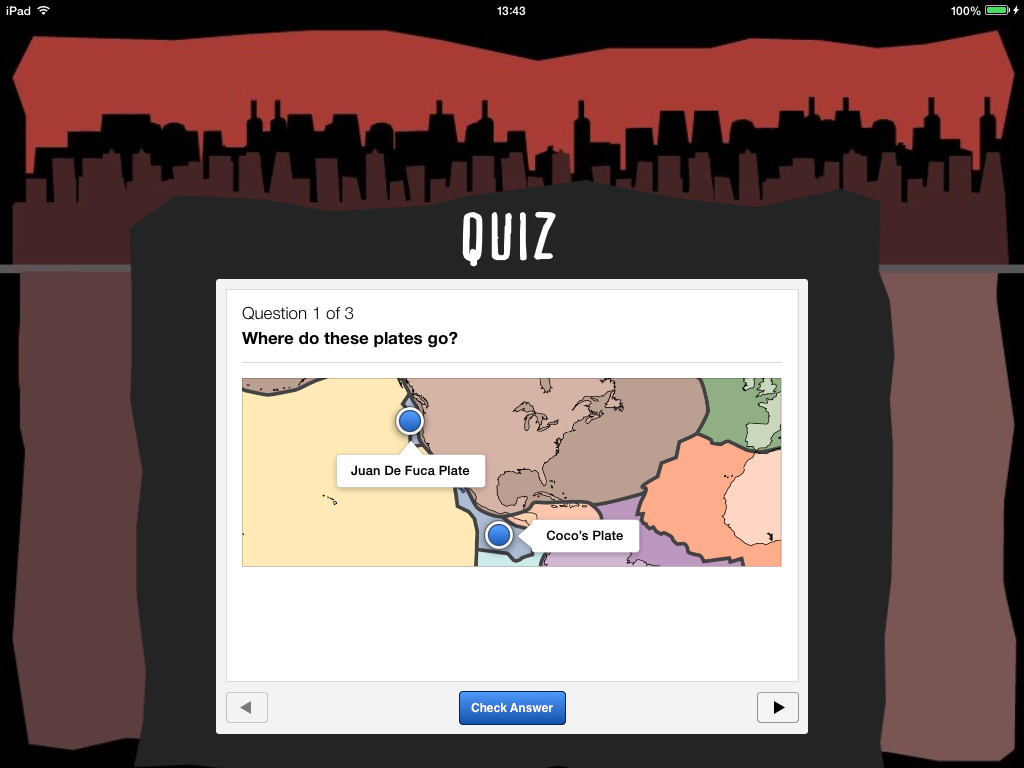
One of the things I added to chapter 1 was a quiz which is a drag and drop quiz which allows the user to drag and drop in the answers on a diagram and decide what goes where. With this quiz I decided to add it because I want people to be able to understand the tectonic plates and what plates there are on the world map. This drag and drop allows the user to drag and drop 2 labels on the world map with the plates showing and they have to guess which one goes where. I have 3 quizzes in total for this section which give the user a chance to guess where certain plates are on the world map.


Fig 6 (Chapter 2 - Section 1 - Unpredictability)

Above in Fig 6 is an example of a section from chapter 2 which is about measuring earthquakes and this section goes on talking about how earthquakes are unpredictable. This section is quite text heavy but the way I tried to make it more interesting and less scary was separating the text into sections with questions which help to answer the questions. This makes the page look slightly less daunting and scary with the amount of text on screen. However despite the interactivity of this iBook unfortunately there does have to be some pages with a lot of text in order to cover the parts of the topic within the chapter.


Fig 6 - 7 (Chapter 2 - Section 2 - Richter scale) 

Above in the two screen shots are from the 2nd chapter within the 2nd section and this section of the chapter goes on about the Richter scale. In Fig 6 it has a picture of the man himself who invented the Richter Scale. And the picture is a pop over which stores information and allows users to click on him to get a brief overview of this man. I added a 'Click me!' with an arrow to indicate to the user that they can click on the image to get info on him. The video on the same page is an introductory video on the Richter Scale and how it works. This will help the user fully understand what the Richter scale actually is. The next page (See Fig 7) has information of the type of magnitudes and what it means in terms of type of earthquake. I'm still unsure on the layout of the page, I might get rid of the image in the middle and make the focal point the 4 boxes and make the larger to they are the main attraction in the page of this section.


Fig 8 (Chapter 2 - Section 3 - Top Five strongest earthquakes)

Above in Fig 8 is Chapter 2, Section 3 which presents the five most strongest earthquakes ever. This is done through a list of the 5 and these are presented in a pop over format which allows users to click on the one they want to find out about and gives information about that specific earthquake. It is quite simplistic and basic but I feel like adding a lot of images etc would be too overwhelming for this page and I wanted to keep the page simple.


Fig 9 (Chapter 2 - Section 4 - Weak earthquakes)

In Fig 9 is the 2nd chapter in section 4 which involves 'weak earthquakes'. I'm still in decisive if I should still have this page because this page talks about the lowest earthquakes and how there are so many earthquakes with low magnitudes that its hard to tell what the place with the lowest magnitude was in history. I'm considering on getting rid of this section as I feel it might be a waste of space, and maybe i'll ask the class when I crit what they think.


Wednesday 19 March 2014

Videos (Thinking of adding in iBook)

This iBook has to be more than just information and facts that can be displayed on an iPad, it needs to be visually engaging and interactive. I've sketched out many interaction ideas and will be presenting them to the class and getting feedback.

Some of the visuals need to be interactive, like interactive diagrams and questionnaires, but all videos too. Whilst doing research I've found a variety of videos which i might potentially use and put in my iBook.

When someone starts to look inside the iBook i thought it would be a good idea to have a kind of introductory video sequence to earthquakes so people starting to read and interact within the iBook can get an overview of what this iBook is about and what impact earthquakes have etc.


Below is a video I found on vimeo which discusses the seismic waves and how earthquakes are caused etc. This is a great video which has great and simplistic illustrations and animation put together and has a simple visual style which is engaging. I like this video and feel like it will help to add to the information and other content i'll be putting in my iBook.


Below is another example of a video i'm thinking of embedding in my iBook, as it talks about the way in which a tsunami is created from an earthquake and would be a useful visual source for how tsunami's can be caused and how it relates to earthquakes, being one of many ripple effects from earthquakes.


Another video i found to be quite interesting is one that uses tables stacked up, one with supposedly more protection another without it and it compares them both against an earthquake testing in order to help engineers understand ways to improve building structures. This is a great video as it helps to highlight what can happen to a non-earthquake proof building and the benefits of having buildings that can withstand earthquakes. Its a very good comparison of one with and another without earthquake protection through the use of tables.


Here's another video i found which is to do with safety tips and in the form of a video and is visually engaging and makes you more aware what you should/shouldn't do during an earthquake. This is animated very well and conveys the hazards that can happen during an earthquake and what to be aware of if all sorts of circumstances. This is why I want to use this video potentially, because it illustrates the dangers and impacts an earthquake has as well as highlighting what to do in a certain situation during an earthquake, which make people more aware.


Link: http://vimeo.com/25782098


The video below is a sequence over a couple of days from the earthquake in Japan which is presented in the form of a view of the world map with Japan in the focal point of the video. This time lapse helps to present the amount of activity within the earth occurred before and during and after the March 11th 2011 earthquake in Japan. This would help to give the user an insight to the amount of activity or movement within the earth before and during and after the big earthquake and what it would look like from a world map point of view, and it is somewhat shocking when you see it when it comes to March 11th and even after that day how much movement there is which I would assume is the aftershock from the main quake.


Link: http://www.youtube.com/watch?v=NSBjEvPH2j4


Below is another video which I'm considering on using, in this video it shows a time lapse of the earthquake in japan in 2011 from the CCTV. There isn't video but the visuals and sequence sped up of the earthquake/tsunamis destruction is powerful. With no sound I feel like the it makes the visuals more powerful and shocking. The reason why I'm considering using this video for supposedly chapter 4 is because it is a great overview of the destruction caused from the earthquake and tsunami from CCTV cameras, which gives it a more realistic point of view to the amount of damage it caused and what happened to certain areas of Japan over time during and after the earthquake.


Link: http://www.youtube.com/watch?v=bBEILNVm37s


Testing iBook (Chapter 1) - So far

Today our class began building our iBooks using iBooks Author and throughout the day I spent my time working on my 1st chapter placing the content, backgrounds, layout and graphics etc. Making sure everything was in place and it was neat and tidy and looked visually appealing. I had a trouble spending a lot of my time having to export all my layouts out and having to re-export them because they weren't the right size or whatever, which was time consuming. If I had figured out the size of the template and had all my graphics and backgrounds etc exported  ahead of time I probably would have been able to get 2 chapters completed on the day.

Despite this I was able to test my iBook using my friends iPad to see what it looks like so far and how it works and navigates through so far on an iPad. After testing it out i'm really chuffed with it so far and how it looks and how the 'pop over' widget works nicely with the icons on my pages, through the touch.

After having gone through it all and testing it I can say so far that the content and interactions from the pop overs, diagram, videos etc so far all work fine with a few minor tweaks from the diagram. The reason why I need to tweak the interactive diagram is because i found when i clicked on one of the boxes it didn't zoom in, so that's something that needs to be fixed.

Below are a variety of screenshots from my iBook so far on chapter 1 of my topic of earthquakes. Also something to note from these screenshots is that chapter 1 isn't completely finished, I still need to add the quiz i was planning on adding and also I need to add a minor contents after the 'chapter 1' page as i want it to highlight whats in chapter 1, and i'll so this for all my chapters, so the user knows whats a section within  the chapter etc.


Fig 1 - Chapter 1 (Title Page)

The screenshot above is the first page so far of the iBook, starting with 'Chapter 1'. There's not much really to comment about this page, it highlights what chapter it is and adds to the theme of earthquakes with it being a view looking at the ground with a whole, where the chapter name is placed. I feel like this design helps to reinforce what this iBook is about and is done in a very simplistic and flat style which helps to link in with the rest of my visual style.


Fig 2 - Chapter 1 (Introduction Info)

This is the next page after the chapter 1 title page, however there will be another page highlighting what's in each chapter i.e. the sections. In this screenshot above it contains just text as its a bit of an introduction to what earthquakes are and how they are caused which then brings me to my 1st section of my iBook. I feel like the text on this page is nicely structured and isn't too overpowering and works well with structured boxes and with the background as well. I feel like adding anything else to the page will maybe make it look to overwhelming and content heavy.


Fig 3 - Chapter 1 (Gallery)
This page is to present a couple of images from the damage of earthquakes to help to put the user in perspective about the dangers of earthquakes and what it can do when it comes to destruction of buildings etc. The only thing that's bothering me is the title overlapping the buildings in the background template. What I might do is leave some empty space for the background where the (heading goes) and have the buildings lowered. This is because to me its distracting me and making think something isn't right about the page and its because the heading is overlapping the background from the buildings.


Fig 4 - Chapter 1 (Introduction video)

This screenshot above is a page for a video on earthquakes and this video works properly and allows the user to click and watch the video. This video helps to show what earthquakes are and what they can do, alongside tsunami's. This is a great way to give the user an insight to the damage from earthquakes. I feel like this page is fine, simple but puts focus on the video which is what I want.


Fig 5 - Chapter 1 - Section 1 (Tectonic Plates)

This page is my 1st section which is about tectonic plates, and this page has information on tectonic plates on the left and a video on seismic waves from earthquakes on the right, which talks about earthquakes and tectonic plates and the ground etc. Its a great video with an amazing and engaging visual style which almost relates back to my visual style. I really like the layout of this page and I feel like there isn't too much going on or too content heavy and the text isn't too overwhelming. The video does work and will allow the user to click on it and it will stream the video.


Fig 6 - Chapter 1 - Section 1 (Tectonic Plates)

Afterwards there is a diagram which is interactive and has a lot f tags on the tectonic plates and what they are called on the world map. If you click on it, it will zoom in with a little more information. Because there's a lot of plates I want to minimize the amount of text that can be found on each of the plates as it might make it overwhelming, if i feel like i need to add more information if i have time i will come back to it.


Fig 7 and 8 - Chapter 1 - Section 1 (Tectonic Plates)

Here above are some screen shots of the same page and what happens when a user clicks on the tags of tectonic plates, i.e. it zooms in with added extra information. This helps to illustrate more interactions and also extra content in interactive items which allows the user with a better user experience and other ways to find information without it just being there.


Fig 9 and 10 - Chapter 1 - Section 2 (Primary Outcomes)

Above are a couple screenshots of the second section of chapter 1, and this section is to do with primary outcomes of earthquakes i.e. destruction and death. These two are obvious primary  outcomes and I created icons symbols in which I used a pop over widget to store information, allowing users when they click on the icon symbols to receive information in a great  interactive way. This helps to make the pages slightly more unique and interactive with cute symbol icons with hidden information, which is much better than have an overwhelming load of text just there. On the iPad when you click on the Icons they bounce slightly, which I thought was really cool.


Fig 11 - Chapter 1 - Section 3 (Secondary Outcomes)

The screenshot above is from section 3 which is to do with the secondary outcomes of earthquakes. These are more to do with the ripple effects of earthquakes and what other ripple effects from that earthquake can lead into other bad activity within the environment. This is similar with section 2 as I have used icon symbols to store information using the pop over widget. I think that this technique is a very engaging and interactive way to encourage the user to read information, by using visuals to represent what they are and once clicked on giving information about that specific outcome. This concept will be used throughout my iBook but obviously not all the time.


Overall the 1st testing of my iBook was sucessful, nearly everything worked fine without any issues, however there a few small changes with layout I need to consider and order of pages. For example I feel the introduction video and gallery of chapter 1 should be before the information of 'what earthquakes are / how they are caused'. I still need to finish this chapter as well as all of the other chapters, so I do have my work cut out for me, but I will keep working hard to get this work done in time for the crit which is next Tuesday on the 25th of March.