So i decided to look at a few book cover designs to help get a broader overview of what i could do for mine and might potentially help be figure out my design style, and layout and imagery i could use for mine.
I went onto Google and looked up 'book covers' and picked random book cover designs that caught me attention and decided to analyse several.

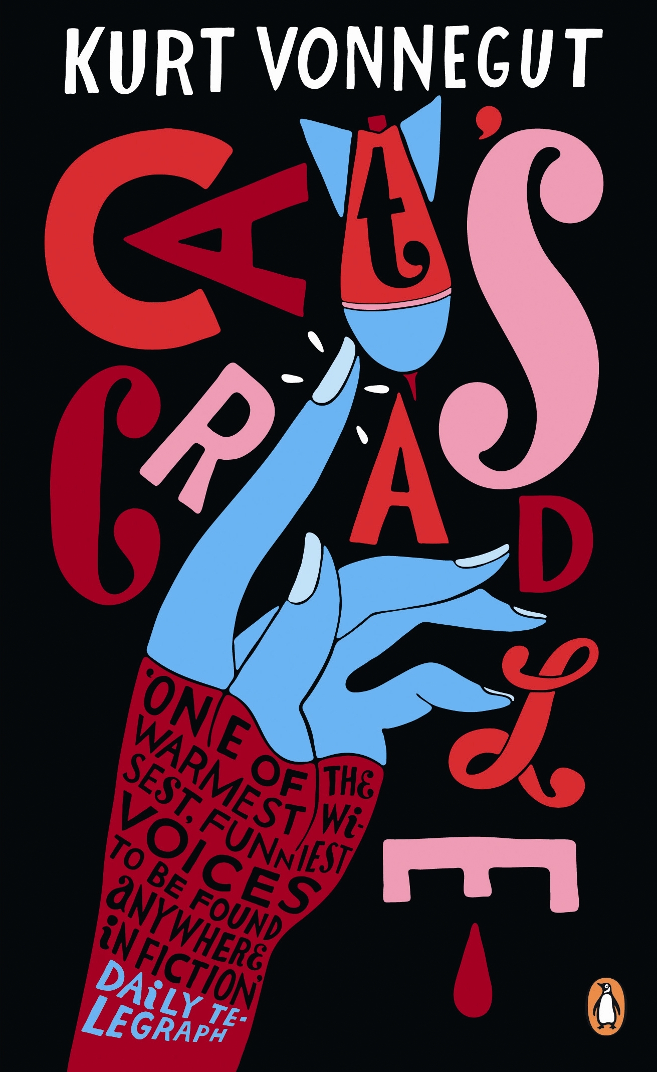
The design of the book is very interesting and has a pop art feeling to it with the simple imagery and few colours. The black background contrasts with the type and imagery which makes it stand out more and helps to bring out the design in a more effective way.
The use of imagery interfering with the type of the title makes the overall impression look more quirky and different which is what you want to see in book stores, books that stand out from the rest and catch your attention and aren't the same as the other books. So the imagery and type clashing brings a more unique and fun feel to the book cover.
The use of different of typography and odd placements and different sizes makes it look unique, and different again it has a art feel about it like pop art as i mentioned before and it works really well. The only thing i would say that might be its downfall would most likely be the text on the wrist, however it is readable but to me looks slightly messy but isn't a big hindrance to the cover on a whole so that's okay.
Book cover -
http://www.penguin.com.au/jpg-large/9780241951606.jpg
.jpg)
This book cover is designed for a classic Roald Dahl story, The BFG.
With this design its a little more basic and plain in comparison to the Quentin Blake book designs. However this one is trying to go for a different but effective look which i think it has achieved.
The only imagery is the hand from the BFG and the girl, Sophie in his hand. The imagery might be a bit plain and basic but sometimes less, is more and in this case it works. The silhouette of Sophie in his hand makes it look more simplistic and less detailed which also reminds me slightly of pop art, which is a good thing.
There is a mall colour palette and good use of typography to make the cover look more interesting, the placement has the hand centered with the authors name under the hand and the time of the book in the palm of the BFG's hand.
Overall its a different interpretation of the book and its design, which worked well and goes to show that sometimes less detailed imagery makes it look more interesting in some instances, like this one.
Book cover -
https://blogger.googleusercontent.com/img/b/R29vZ2xl/AVvXsEgwIJ6wr9bVsroiHX8c4vGD99z2-gkld89zWuyqYZOHvvOkx0pmuwitItsBBKof7kN25fJGfckeLbguWzQFH1kJdu3OjkVzBxW6lqiWsAhJ3FK7pZKmTKsP6l0xWPIZvE3H2VESAsttsNoi/s1600/The+BFG+%252872%2529.jpg
 This book is slightly different from the two books i looked at above but still managed to catch my attention. This book is written by Jonathan Saran foer and the book is called Everything is Illuminated.
This book as i said is slightly different from the two above, and this is because there isn't any imagery. A lot of books do this and to me it feels strange but if the type has been placed and used effectively and works well it can still catch peoples eyes and did when i came across it.
With this cover there is no imagery but the typography is a san serif and has a chalk board feel to it with the contrast of black background and white text, which adds to this look. The type is like a hand written or brush type and works well.
Its very large but covers the entire page and does look slightly crushed together especially with the smaller extra text around the title which makes it look slightly messy. However the text is bold and eye appealing and i like the use of type and the way it flows with harmony across the cover.
Book cover -
http://www.abebooks.co.uk/blog/wp-content/uploads/2012/09/Everything-is-Illuminated.jpg

The imagery is somewhat like a silhouette and uses a blue/green textured colour for it along with the title of the name. The colour of the background is white in order to make the colours and imagery from the type and images jump out and grab children's attention.
The type is placed right in between the pages of the book which makes it look like its jumped out of the book. The type is a serif text and is used to give a more classic and old feel to it rather than a modern feel to the fairy tales which is what anyone older wouldn't want children to grow up with, most of us want children to grow up with old classical stories rather than bad modern ones now.
The books back cover is simple and basic, giving information is a neat and organized way, however a lot of book covers don't hold out for the back cover and uses imagery or incorporate both the front and back together which makes the covers look unique, so i feel this one could of used more imagery underneath the text on the book cover perhaps.
Book cover-
http://blog.joshuarousen.com/wp-content/uploads/2012/03/cover1.jpg

Here's another book from Puffin that i saw, which caught my eye, The Wind in the Willows.
This cover is very interesting and has a classical feel to it with the art style and the strong use of reds and contrasts with the creamy colour as well. It looks simplistic in that sense, that there isn't much of a broad range of colour but would have made the overall appearance of this cover look too heavy and strong, this design has a subtle, classic feel to it which is what i like.
The use of the handwritten type helps to add to this and i like how on the back cover they explored into the design more and it works well making the back cover look interesting and work nicely with the front cover as well. Because the target audience is for children since it is a puffin book the imagery is an important element and having a good amount of imagery on the back as well as the front would get more children interested int he book on a whole.The imagery has a slight classy look but the use of the 'poop' from the car noises makes it seem more comical and lighthearted and works well with the overall design of the book cover.
Book cover-
No comments:
Post a Comment