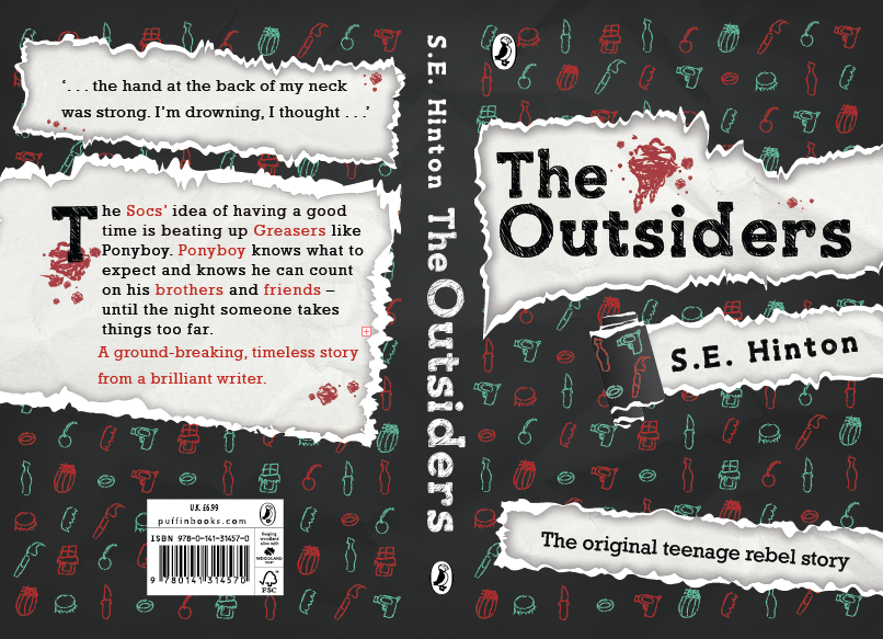
The main critique i was given from my book cover was:
To line up my the slanted text to make the baseline level and evenly placed.
To have the torn part on the back partly torn to the side and not torn in the middle.
This was the main critique i was given within my book cover design and a lot of people praised my work and loved the final design which i was very pleased about.

The other critique i was given was directed towards my A2 poster which was:
Get rid of the paper at the side as it ruins the whole concept of the torn parts of the poster.
Another idea was to place the puffin logo in the torn part at the side of the poster.
Also was told that the book itself should be slightly larger.
People also suggested to make the torn pieces not look so neat and even on the edges so it portrays a more messy and similar feel to my book.
Also someone suggested i'd used the paper background in the inside of the poster and get rid of the patterns on the poster background so the book itself would stand out.
This was the main critique i was given from most people in the class, however again most people seemed to like the concept and the design of it all, it was jut to make these small tweaks to make them look more finished and improved.
After listening what everyone has said i've taken it all on board and made most of these improvements.
No comments:
Post a Comment