Since The Outsiders is my chosen book i wanted to look into a lot of 1950 - 1960's retro graphics, through visuals and typography and colour schemes from the imagery etc. Even though i had looked at a few examples before i really wanted to broaden out more with retro/vintage styles and find more and look at different ways it interpreted. Also its set in America i wanted to lean more to some 1960 retro graphics which relate to that era in America.


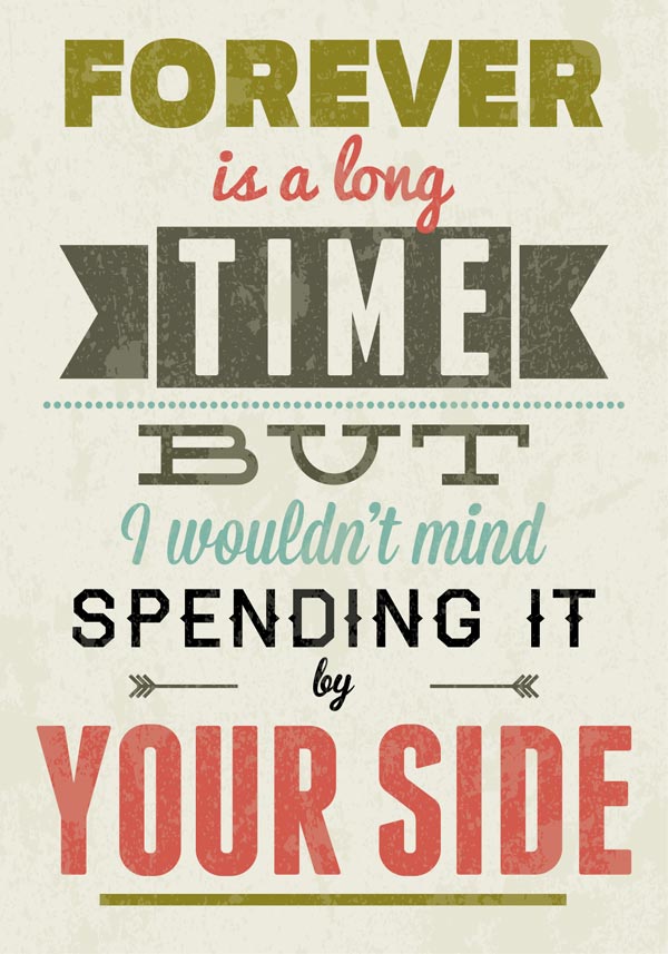
These are a selection of imagery and type combined which have an inspired theme from the 1950's to 1960's of the 'retro' style which uses a selection of type and textures and colours which were very commonly used back in the time of the 60's. The colour on most of the examples is very bright, some with more pastel colours than others but have that sense of 1960's America with the design, colour choices and overall appearance and layout. A range of type that is used to give it more of an interest and some type being used like slab serif for example really adds to the retro feel and gives a highly inspired look to the 60's.
Imagery:
http://idesignow.com/inspiration-2/retro-vintage-typography-design-inspiration.html#.Uo1A2MS9DIc
https://www.pinterest.com/pin/240942648784468835/
http://www.pinterest.com/pin/268738302735641459/
https://www.pinterest.com/pin/516577019728364018/
https://www.pinterest.com/pin/210121138834392170/
https://www.pinterest.com/pin/370702613049334325/
https://www.pinterest.com/pin/533746993307138280/
Justin Skeesuck

Above are a couple examples of 1960 graphics made by Justin Skeesuck and was influenced by the matchboxes from the 1960's. The aspects i really like about these examples is its graphic style with no outlines on the characters and the shaping and simplicity of them which give it that 60's inspired look to it, in its design it's also very minimalistic and making both of the examples look visually appealing to look at. LINK:
Colour


Something i noticed whilst researching 'retro' 60's related graphics is that a lot of them used similar colours, and one of the colour palettes included contrasting colours like, blues,creams,reds and blacks. This is not only on imagery and background but typography as well on some of these examples. These colours made me think of including the palette in my own design. I originally thought of what colours to use as i was first sketching my ideas and after seeing these examples its encouraged me to use a similar colour palette to the ones above in the examples. This palette has a very contrasting and appealing look about it and also something i noticed it somewhat uses the colours from the American flag, except the blue is more of a light blue/green than a dark blue but still gives that retro American look to some of these examples. Because the palette works so well together it'll most likely be the main reason why i'll use these colours for my final colour palette in my book cover design for The Outsiders.
Imagery:
Typography


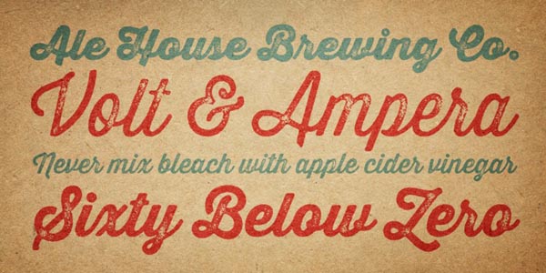
These are some examples i found of 'retro' or 'vintage' Graphics that incorporated some typography into various work, using it as their core visual attraction to the work. All of these are different and a lot of them have the 'American' and 'retro' inspired aspect to them which is what i was looking for. I noticed that some of them use the gritty/dirty texture not only in just the background but in parts of the type and I've seen it in a lot of imagery relating to the 'retro' 1960's look. Since 'Helvetica' was big around the time as well as san serif in general these inspired 60's styles do use a mixture of type including a lot of san serif text. Some of these examples to use slab serif text, which is more bulkier and seen a lot in this time period and makes me think of diner signs and posters in the US back in the 60's. With my type for the title of my cover I've seen a few fonts and i do like the slab serif look but I've also found some hand drawn, scruffy fonts which would work really well with the book and the story, since its about gangs.
Imagery:
http://designspiration.net/image/210268555932/
http://indulgy.net/Db/i3/eh/22518066856335905PhdL8xk3c.jpg
http://www.designbolts.com/wp-content/uploads/2013/01/Love-Typography-design-Poster-2-01.jpg
https://www.pinterest.com/pin/79305643411255555/
Design-Studio-34563453.jpg
https://www.pinterest.com/pin/310678074264900810/
Other Various Imagery


A lot of these examples of imagery inspired around the 50's - 60's make the appearance look very minimalistic and simple but effective. The imagery isn't that detailed and uses a small colour palette to make it look more simplistic but visually appealing. Some of these examples use contrasting colours making the imagery more effective and eye catching i especially like the 3rd one with the woman's legs and the leakage from her lags its works really well and is visually pleasing and intriguing. The 2nd one with the perfume bottle is very attractive and i love the pencil style the artist uses to give it more of a personal, and informative look to it, looking more hand drawn, and this is something i want my cover to look like, hand drawn and informal to give it a unique and nice illustrative look towards it.
Imagery:


Here above is some other various 'retro' inspired 60's America graphic design, some of these examples use a variety of different typography, serif, san serif and slab serif which makes it look very modern and complex but still gives that retro 60's feel to it with the small colour scheme and the choice of colours, like reds, creams, whites and blues. I particularly like the coke bottle top which really gives that America vibe to it with a vintage twist to it.
Imagery:
Milton Glaser

.jpg)
.jpg)

.jpg)
I looked into more 60's retro/vintage styles and i came across some of Milton Glaser's art work which was 1960 inspired. Milton Glaser is an American graphic designer and some of his work was used with Push Pin Studios to get it noticed through media and different countries as photography had dominated the industry of design at the time and they wanted to shown that graphic design could be just as powerful and visually appealing and attractive. Making these types of designs helped to get noticed around the world and the US and was very successful. Pin Push Studios not only make graphic design but also make typography which is inspired my the 1960's and some examples of their type is in some of these images above of their work.
Imagery:
http://blog.i2fly.com/?p=2510
http://www.thedrakehotel.ca/blog/2013/01/if-you-want-be-smart-take-art/
http://sweetjanespopboutique.blogspot.co.uk/2012/05/vintage-ad-milton-glaser.html
Other resources: 'retro graphic design pocket essentials' page 208
The aspects l love about his work is the silhouette and contrast from the black and white then the striking and bold colours from the hair which makes the overall impression look very unique and eye catching and i love his style of work.
No comments:
Post a Comment