Over the last couple of days from when i last updated my testing of my iBook, back then I only had 1 of 4 Chapters mostly complete, now I'm at the point where most of my content is in my iBook for all 4 of my chapters and now i'm just trying to make it look presentable.
On the Wednesday I was able to get through parts of my chapters and work on them, however because we had a BBC testing event going on in our class we had to move to a smaller, more compact room to get work done whilst we waited to test BBC's product. This made it a lot harder to focus and get work done as we had to copy over a lot of our files and work in a smaller environment which was really hard to focus in with around 8 of us in this small room.
Because we had limited time to get work done in class for this iBook and the fact that we have a crit coming up, I decided to come in on the Friday to get more work done and try to organise my content within my iBook.
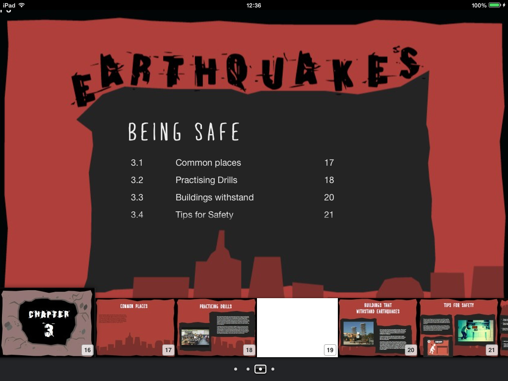
Fig 1 - 4 (Table of Contents)
What I decided to do during a part of the day i came in for on the Friday was sort out the table of contents for my iBook. I decided that I was going to go with the way iBooks Author built in the table of contents navigation rather than over complicating it all. This means that the path of the iBook I'm creating is somewhat linear to a degree, but users can go to the table of contents and click on any of the chapters and sections they want to go to. Above are a couple of screen shots of the layout to the table of contents for each chapter. I was limited with the placement on each of the chapter contents as it moves all of the text on every page of the contents, so i had to compromise and use a layout that all of the chapters on the contents could fit well on.
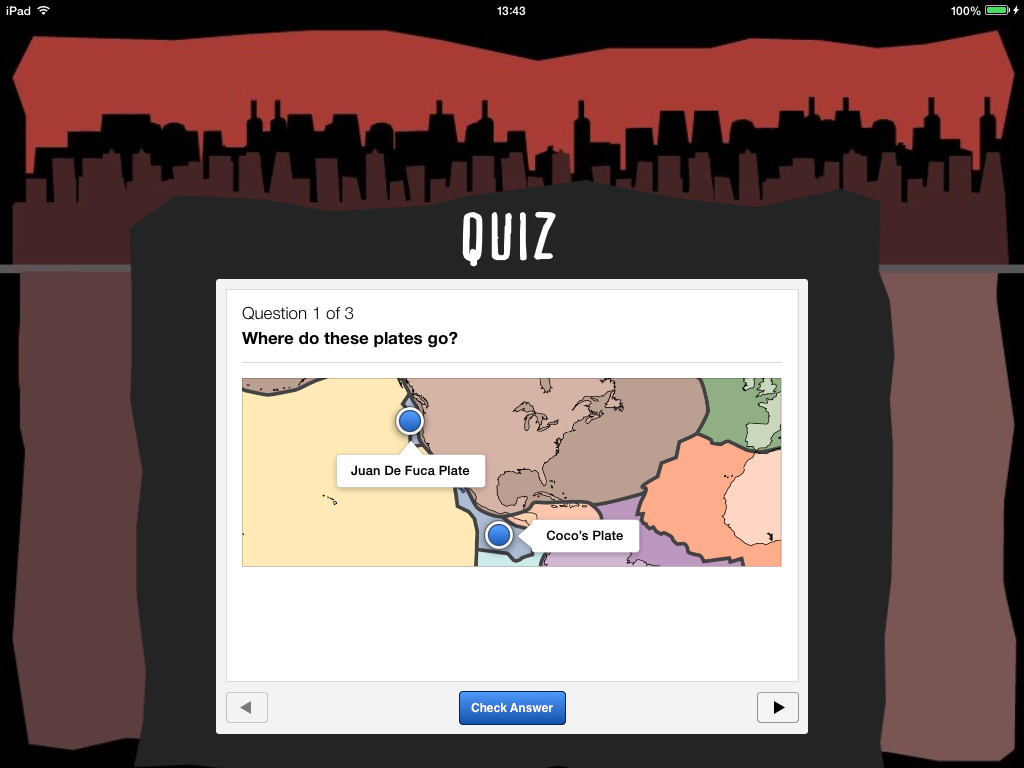
Fig 5 (Chapter 1 Section 1 - Tectonic plates quiz)
One of the things I added to chapter 1 was a quiz which is a drag and drop quiz which allows the user to drag and drop in the answers on a diagram and decide what goes where. With this quiz I decided to add it because I want people to be able to understand the tectonic plates and what plates there are on the world map. This drag and drop allows the user to drag and drop 2 labels on the world map with the plates showing and they have to guess which one goes where. I have 3 quizzes in total for this section which give the user a chance to guess where certain plates are on the world map.
Fig 6 (Chapter 2 - Section 1 - Unpredictability)
Above in Fig 6 is an example of a section from chapter 2 which is about measuring earthquakes and this section goes on talking about how earthquakes are unpredictable. This section is quite text heavy but the way I tried to make it more interesting and less scary was separating the text into sections with questions which help to answer the questions. This makes the page look slightly less daunting and scary with the amount of text on screen. However despite the interactivity of this iBook unfortunately there does have to be some pages with a lot of text in order to cover the parts of the topic within the chapter.
Fig 6 - 7 (Chapter 2 - Section 2 - Richter scale)
Above in the two screen shots are from the 2nd chapter within the 2nd section and this section of the chapter goes on about the Richter scale. In Fig 6 it has a picture of the man himself who invented the Richter Scale. And the picture is a pop over which stores information and allows users to click on him to get a brief overview of this man. I added a 'Click me!' with an arrow to indicate to the user that they can click on the image to get info on him. The video on the same page is an introductory video on the Richter Scale and how it works. This will help the user fully understand what the Richter scale actually is. The next page (See Fig 7) has information of the type of magnitudes and what it means in terms of type of earthquake. I'm still unsure on the layout of the page, I might get rid of the image in the middle and make the focal point the 4 boxes and make the larger to they are the main attraction in the page of this section.
Fig 8 (Chapter 2 - Section 3 - Top Five strongest earthquakes)
Above in Fig 8 is Chapter 2, Section 3 which presents the five most strongest earthquakes ever. This is done through a list of the 5 and these are presented in a pop over format which allows users to click on the one they want to find out about and gives information about that specific earthquake. It is quite simplistic and basic but I feel like adding a lot of images etc would be too overwhelming for this page and I wanted to keep the page simple.
Fig 9 (Chapter 2 - Section 4 - Weak earthquakes)
In Fig 9 is the 2nd chapter in section 4 which involves 'weak earthquakes'. I'm still in decisive if I should still have this page because this page talks about the lowest earthquakes and how there are so many earthquakes with low magnitudes that its hard to tell what the place with the lowest magnitude was in history. I'm considering on getting rid of this section as I feel it might be a waste of space, and maybe i'll ask the class when I crit what they think.


.PNG)
.PNG)
No comments:
Post a Comment