 |
| Fig 1: Chineasy Banner |
Fig 2 and 3: Chineasy examples
Here above are a few examples of how this book combines both text of the Chinese language and imagery and incorporates them together in order to form a visual way of learning Chinese. Using vary solid and flat colours and flat type and imagery/icons.
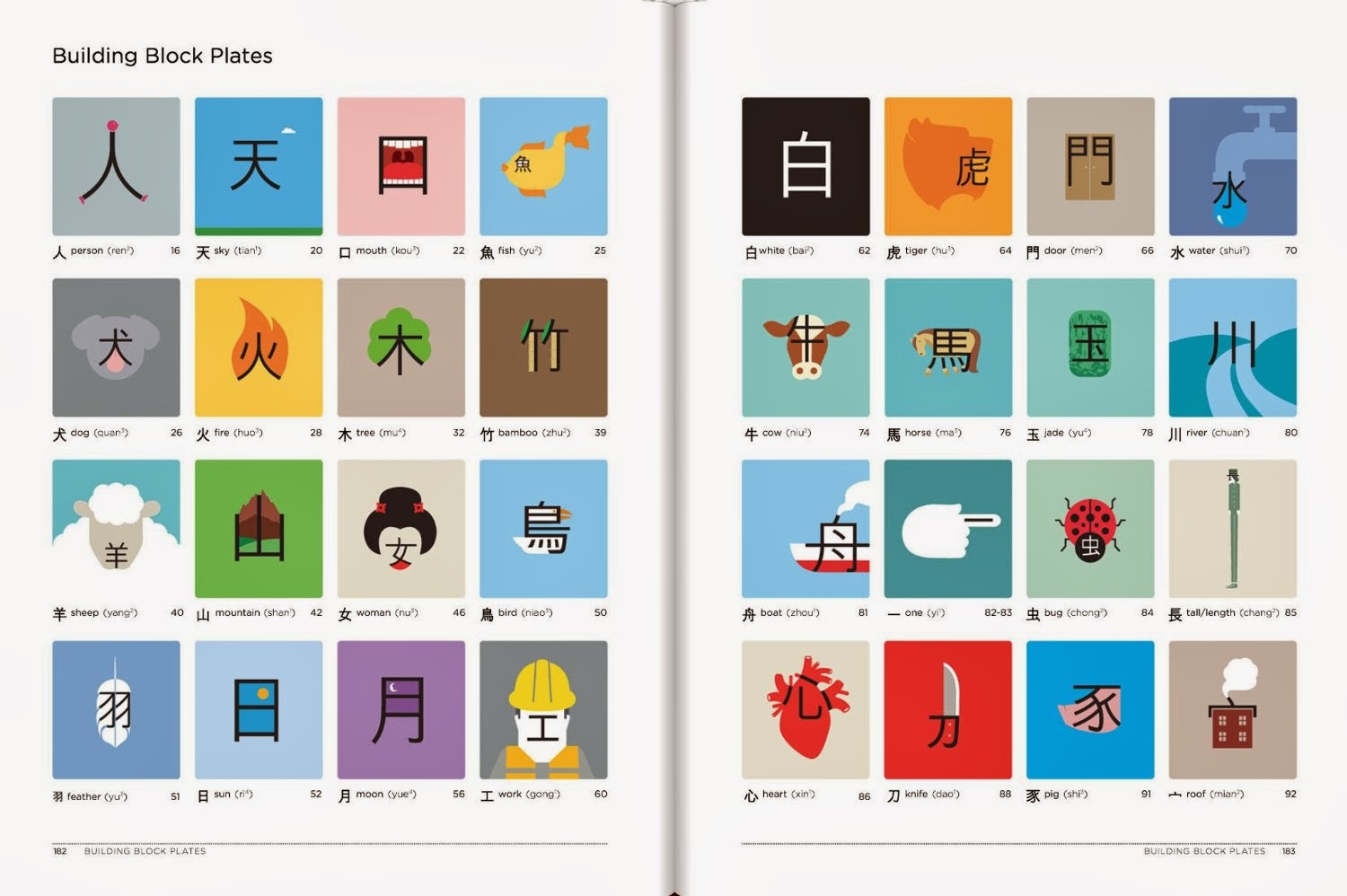
I did a little bit more of a look and insight to the book and looking at the content within the book, and it blew my mind. Below is an example of some of the topics of words within the book you can learn.
Fig 4: Collection of different Chineasy words/styles
This is a great example of all the flat images and flat solid colours used to make the content and way of learning Chinese simple but effective and done through both visuals and text which have been entwined together to create more engagement with the reader or user for the iBook.
To me its just so inspiring of how they've made learning Chinese to imaginative and different and unique and it has been done in such an outstanding way that it really makes me want to learn Chinese just so i can look at how visually pleasing it is, and in fact I'll probably pick a physical copy of this book as its such a huge inspiration.
Fig 5: Chineasy example of symbols/words used together
Occasionally they will use words and them place two words (images) next to one another in order to create another word or phrase and here is an example above that incorporates that. This helps to make it more obvious what other words with this signs can mean and how putting them together or next to one another can create another meaning or phrase.
Fig 6: Example of book Chineasy
Fig 7: Example of book Chineasy
Within a lot of the pages it seems that the content that's mainly in this book is thee imagery which forms the text of words of Chinese. There isn't too much text on the pages as you can see above and there a lot of similar images used in order to have the words which are related it presented within that topic of the word so people can get a good flow of the word and similar words used which will help the reader process the Chinese a lot better than having words just randomly appear on certain pages and ones related to them on other pages no where near the main word. So its a good way to look at one word and then focus on words or phrases related to that word.
Overall there is a new way to learn Chinese through image and Chinese text combined in order to help people, mostly visual people understand and comprehend the Chinese language. This way is inventive and innovative as its quite distinctive and different but looks very visually engaging. The use of flat design and colours within the icons and imagery help to make the book look more simplistic and overall very visually pleasing, and even though its quite minimalistic it works really well.
Below is an example of a video from the author of the book 'Chineasy' talknig about how to learn Chinese from this book.
Link to video http://www.youtube.com/watch?v=T5FNvW19GbA#t=133
And below is a link to the authors site.
Link to Site: http://chineasy.org/
Link to kickstarter: https://www.kickstarter.com/projects/shaolanchineasy/chineasy-begins-0


No comments:
Post a Comment