So to start with researching the next visual style of pop art i went to look on google for some background on pop art, and ended up finding this:
"Pop Art is the movement in art when artists began to create art with the subject of things that are the iconic in nature such as famous people, advertising, and movies. The British and the American people were responsible for setting off this type of art in the 1950's and 60's. In art history, art movements are attached to time periods. It is the most recent form of artistic movements next to postmodernism. Abstract expressionism precedes pop art."
http://www.osnatfineart.com/pop-art.jsp
So to put this in my own words, Pop Art is a popular type of art that was first brought out in the 1950's and was a very common and highly admired form of art at the time. The art was used to relate it to things like comics, movies, advertising etc.
Once i had an overview of Pop Art and a bit of the background i then looked into different Pop Artists in order to seek some of the type of work they created to get an overall point of view of the visual style of Pop Art and how its portrayed.
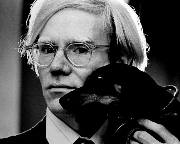
After googling Pop artists the most common were Andy Warhol and Roy Lichtenstein.
 |
| Andy Warholhttp://en.wikipedia.org/wiki/Andy_Warhol |
| Roy Lichtensteinhttp://en.wikipedia.org/wiki/Roy_Lichtenstein |
I decided to look into some of their work. I began looking into Andy's work and here is some of his stuff below.
http://www.ilovesensus.com/wp-content/uploads/2013/10/Opere-di-Andy-Warhol.jpg
Above is one of Warhol's most popular pop art work which has a selection of popular celebrities at the time in the 1950's some people will obviously recognise. This work is chopped up with a individual portrait of each famous person and them placed together as a collage. The colours are very bright, solid colours to give a very pop arty feel and make it eye catching. There isn't any typography in this piece mainly to make the portraits of the people the main focus. Each of the portraits are slightly different through the way they are presented to show a lot of interest to the piece on a whole with the slightly different looks in each portrait.

http://www.easyart.com/trends/2011/12/marmite-art-prints-get-a-andy-warhol-pop-art-makeover-love-it-or-hate-it/

http://swanmoreart.wordpress.com/category/ks3-art/pop-art-food-and-drink/
The next bunch of pop art is also from Andy and these are of products i.e. food products. Pop Art was related with not only famous people but with advertising, products from everyday life that we may see on television as adverts and marketing were very important at this time.
The colours in some of these are simple, with the marmite its very bold with its strong colours that help to brighten up the piece and bringing more interest to it. Whilst the other two use very simple background colours in order to make the product itself the main focus.
Now let's take a look at Roy Lichtenstein and his Pop Art work. i've seen a few pieces of his work before in the past since i took Art back in school so i kinda have an idea of what type of pop art work he did in the past.

http://rap361.com/?p=22933
So just looking above at one of his pieces of work we can already see that his style of pop art is more related to the comical, comic book strip themed pop art style, and he carries this style out in a lot of other work of his. What makes this relatable to the comic strips is the use of tiny polka dots of the characters which was a common thing for comic strips as well as the think outlining of the characters.
http://blogs.artinfo.com/artintheair/2012/10/18/see-roy-lichtensteins-cover-for-newsweeks-1966-pop-art-issue/
Comic book strips occasionally had typography for punches and kicks and in this one is a clear example of the comic book strip theme along with the limited amount of colours which not only gives it both a comic theme and a pop art theme but an animated cartoon theme as well.

http://seaofgray.wordpress.com/2013/01/08/kate-spades-pop-of-color/
Roy did make a huge amount of pop art relating to the comic strip theme visually and has really worked well through the style of comic books and the simplistic, limited amount of colours that are bold and eye catching.
Overall Pop Art contains a lot of aspects which make it what it is.Such as the following:
Limited colours: (Uses around 3-4 colours in each piece of pop art)
Outlines (Usually thick black out lines in pop art)
No Background (Ocassionally just a solid colour fill for the background)
Bright Colours (the colour scheme consists mainly of bright vivid colours)


No comments:
Post a Comment