So below are some examples where i went into photoshop to get some of the colours out from examples to show what colour scheme these people used from these posters..
 |
| http://designyoutrust.com/wp-content/uploads/2012/09/steampunk-laser.jpeg |
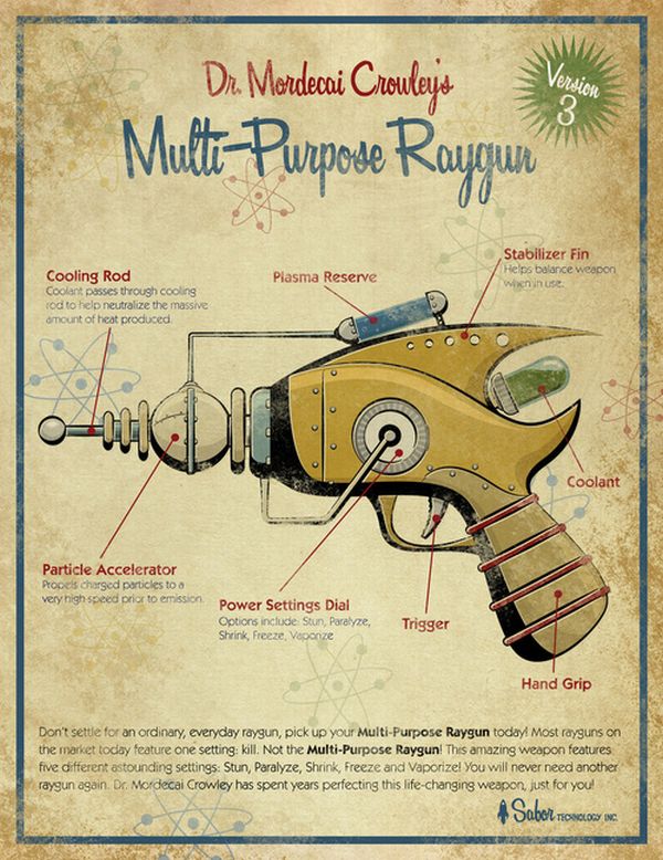
This one uses a lot of creamy/gold colours along with dark colours i.e. moss green, navy blue and a red. These colours are tended to be used often because steampunk is industrial and old and set in around the Victorian era there are more vintage colours used together i.e. golds, creams, reds and the green and blue is more toward the machinery and dirt of steampunk.
 |
| http://fc05.deviantart.net/fs70/i/2012/104/7/7/steampunk_poster_by_rice_claire-d4vr8c5.jpg In this example we can tell the colours here are more darker fitting into steampunk a lot more with the very smoggy and industrial colours we would've seen back then and these colours are mainly portrayed through the outfits and with the vintage gold/browns in the background, this really fits the steampunk colour platette. |
 |
| http://th03.deviantart.net/fs71/PRE/i/2012/105/1/3/steampunk_worlds_fair_poster_2012_by_felixxkatt-d4wa2vi.jpg This one above is a little different, it does contain browns, creams, reds, and even oranges but these colours are more brighter and bolder to create a very visually impacting poster and making it somewhat modern with the old theme of the steampunk. The colours help to bring out the poster on a whole along with the starburst background and bold text and imagery. Overall the colour scheme is a little more bolder than steampunk art or other work usually is.
So overall this helped me to gain more of an understanding of what colour schemes usually appear in steampunk and why they used them and its helped me to consider what colours i may use but taking a guess i would say i'd be using colours like browns, golds, greys, blacks, oranges and creams but i still don't know exactly what shades etc.
So now what i'm going to do is experiment most likely in adobe illustrator with colour palettes as well as layouts and typography to get a better consideration of what to do with my work and how i may want it to look as a whole including these aspects to it. |
No comments:
Post a Comment