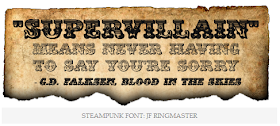
So after looking into the different visual styles we had to choose from for this science poster assignment as i was researching into Steampunk i began to really admire the overall theme and style and thought i potentially would go for this style for my science poster. After considering steampunk more and more and gathering ideas in my head of how i might make my poster with the theme i wanted to look into the fonts that i might use for the poster and what would fit with steampunk.
I decided to look on Dafont since they have a great range of font choices, and since steampunk is set around the Victorian era i wanted to look for fonts that might be similar to both steampunk and Victorian since they are set around the same period. However i did end up looking on different sites for steampunk related fonts to get a better spectrum of fonts that i think could work well or not.
As you can see above i looked at a variety of different types of steam punk styled typography, some a little bit more crazier and over the top and some more subtle. But all of these caught my eye because they had some unique features and something i thought that would fit in well with the Victorian/steampunk era and something i feel i could work well with. Most of these fonts were serif because at the time in the era everything was a bit more formal and elegant and some of these fonts convey this and others are more informal with the way they are designed but still work well with this project.
At this point i am still indecisive to which font i may or may not use and i might use a combination of multiple fonts or use some and or create my own or design my own, so I'm still figuring out what fonts i will use and I'll probably experiment in illustrator and see what works best and I'll keep you updated on that.


No comments:
Post a Comment