Wednesday 30 April 2014

Starting to use HTML (class exercise)

In class recently our teacher went through a lot of stuff with html, introducing us to quite a bit of terminology and html information and how websites are made etc. Our teacher gave us a folder containing an 'index' html document, shown below. 

(Original 'index' document) - visual on browser


Above is the main html document 'index' which displays this content shown above, and this site sites on a 16 column grid and the html that displays this content is shown below. the '<div class="one-third">' allows the content to split up the 16 column grid into three sections and because there are three lots of text and most of the code is the same expect the actual text it allows the text to sit next to one another on the same row because they all contain the same class.


Later we were asked to edit the 'index' document so that this would display on screen:
  • 4 columns 
  • 1 column
  • 2 columns
  • 3 columns
  • 1 column
  • 1 column

I then went into the text wrangler to edit this and complete this task and what i had do was, copy the following:


I copied the html and then i changed the class to "four columns" for the 1st one and then added a <hr/> tag which gives an underline at the bottom of the text in order for the content to look need and structured.


I then did this process by copying the html and changing the class according to the task and adding a <hr/> at the end within the </div> tag and so on. This later led to the 'index' page looking like this below.


(Edited 'index' document) - visual on browser

As you can see all of the content fits within the designated columns and they all have an underline underneath the content, which makes the text look more structured and neater. This exercise in class was very useful and allowed me to work more with html and get refreshed on how to use it and work with tags etc. However i have not done any CSS yet but will come round to it soon in class and mess around with it outside of class as well to get used to all the coding.

Tuesday 29 April 2014

Starting web design Research

After coming back from Easter holiday we now have our new assignment which is to do with web design and moulding our ibooks into fully responsive functioning sites. To start with for this project i wanted to look at a variety websites and web design, which will help me gain a better understanding and idea of what i want my website to look like, as well as give me inspiration for the design and style of the website for my topic of earthquakes. This will also benefit me to know not only what i want the visuals to appear and look like on the different platforms but technically how the website will function as well on all of the platforms.


To start with i went onto Google and i typed in 'good web design examples' and was able to find a website which contained a lot of different examples of well designed websites, so i began flicking through the site looking for inspiration and scrolling through the examples until a few caught my eye and i was able to find a few sites which appealed to me, most of them being very simplistic and minimal layouts and styles.

Because the website we create is going to be responsive we have to make sure that the website is well-laid out and isn't too heavy on content as it has to be viewable on the iPhone and the iPad as well as a desktop or laptop, so to a degree it has to minimal or simply structured i the layout, and with mine i want it to be that, i.e. simple, minimal but well designed and i found some great web design examples which are quite inspiring.


In this example above the website is very simplistic and very minimal with the hope page containing simple and clear navigation on the top right and type in the centre of the screen, making it the main eye catcher. 

the typography uses a san serif and what i like about the type on this site is how informal and casual it looks, which as a warm about this site and more based around design. Its quite bold and tall so it stands out, along with the white colour of the type. The background uses flat colours, which adds to a more simplistic style for a website, but works really well.

Within each of the pages they are even simple and but quite interactive and has a lot of movement which is what makes the website even more engaging and unique. Something I also noticed is that there is a lot of blank space within the site, however because the website isn't as big as a e-commerce site it doesn't need a lot of content filling in the space. Because this website is a personal site of someone and their work it doesn't need too more dynamic or over the top content which displays it, the less there is the more likely it is to be engaging and less straining. For my website I don't want the content to be over the top, so the main homepage in particular I want to look simple and be visually appealing towards someone who would come across it.


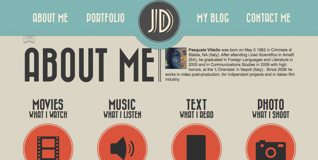
Another website i found attractive was a nice 'retro' themed website, and the thing with this website is that the pages are all on one main page, and when clicking on the navigation it scrolls down to that page. This is quite unique and would work really well for a phone for someone who didn't want to have to scroll all the way down. 

The visual style of the site is really attractive and the navigation being always attached the top of the page even when a user scrolls down is a very good way of making it easier on the user and preventing them from having to scroll all the way at the top of the page to click on the navigation.

The colour scheme works really well within the whole retro themed site and the site occasionally uses icons to represent information, which is something I did in my ibook and is something i want to do in my website and the design, as i want the website to be more visual and engaging instead of bulks of text.

I really like the navigation system and is something i might consider, and something I also like is the logo of the site in the centre and displayed within the navigation and is something I will consider when I come to designing the layout and overall appearance of my site.


Link to site: http://pulpfingers.com

Above is another website I came across and what caught my eye about this site was the colour scheme. The reason why I gained an interest when i first saw this site was because just looking at it made me think of my ibook because of the colour scheme with the reds and white and gray/blacks.

I really like this site for its illustration and cute icons and layout. It has a very simple flat design look about it which is why it reminds me so much of my ibook and the visual style i created for mine. The colours on the page work well and the red isn't too strong on the page and work well against the white text and black/gray illustration.

The illustrations are quite similar to mine in that the page uses a type of building skyline illustration on the bottom of the page, and also the page uses cute, small icon illustrations to refer to certain things about this site.

At the top of the page it uses a slide show type of rollover which displays what the website does which is a good way to introduce the type of site it is and creates a very engaging way to come to a website for the first time. The navigation is around each side (left and right) of the banner/ logo of the website and is a great way to display the navigation as well as putting focus in the logo of the website.

Overall the website is quite small and has some very amazing visual style appeal to it and uses a good colour scheme with muted colours so it doesn't overdo it with too bright or sharp colours which is a benefit, as it allows people to enjoy and read off the website, as well as not straining people's eyes. The illustration and layout of the website is really well done and creates a very simplistic and flat style to the site on a whole which is a god thing.

It defiantly reminds me of my visual style for my ibook, so this will be my inspiration as well as many other websites, but i will keep looking for more to give me ideas and inspiration when design and thinking of the way I'm going to lay out my content as well as how it will visually and physically function for the users.

The only negative with this website is that it isn't responsive, however this doesn't detract from the inspiration that this website has given me. 

Sunday 27 April 2014

Responsive Web Design Example


After finding out about what 'responsive websites' are, i took it upon myself to look at an example of a responsive website and discuss it here and talk about the appearance as well as the benefits of responsive web on tablets and mobile devices.

Below is an example of a website called 'smashing magazine' and i was able to find on another website with an image which displays the web page on three different devices. Main one being desktop, the other being tablet and the final one being mobile (shown below).


Link to 'Smashing Magazine': http://www.smashingmagazine.com

Desktop:

Let's start with desktop, so this is the main large device which will display a widescreen full view of the whole website with everything on screen and nothing hiding. This is usually how websites start as when being built, usually its built on a desktop and is made according to the display for most desktops and then downgraded and changed for the tablet and mobile devices to view the site.

The positives about the website here on a desktop is that it is wide and is able to present a lot of content within the page because its large enough to do so, however to some it might look overwhelming because of the amount of text on screen or get confused because of the navigation or whatever.  Overall on the desktop for this site you can see that its wide and allows room for a lot of content to be presented to the user when they access the site.

Tablet:

With the tablet version of the site, it isn't in wide screen, however the tablet can be moved around to create a landscape view of the site which might display the site in a different way than it would portrait. Overall you can tell that on the tablet version in this instance that it isn't widescreen and isn't as large as the monitor for the desktop as its a handheld device.  As you might be able to tell that a lot of the content to the right on the desktop has completely vanished on the tablet version, as well as the search bar has moved underneath the logo in the tablet version, and also the navigation to the left has also been taken out in the tablet version, and this is because of the size of the tablet.

Because the tablet isn't as big as a desktop monitor it an't fit all the content from the original desktop version because there's too much content to fit within a small screen, and if it was done it would make it very hard to read for the user. Because users want to be able to read whats on screen whether its a desktop or tablet or mobile its important that the user can see it as well as be able to read it.

Mobile:

As you can see to the left/middle of the image above you can see the mobile version of the site of smashing magazine. Because most mobile devices are very small its impossible to have all the main content from the desktop or the tablet version of the site, so more needs to be hidden and taken out in order for anyone to be able to view the site an its content. In the image with the mobile version of the site you can see there isn't too much detailed content in there its all laid out on one row with other content sitting underneath each other, due to the lack of wide space on mobile devices. If the website was turned around landscape it might look slightly different, but despite this the content is quite minimal making it as easy as possible for mobile users to view the site without being overwhelmed or  being put off by all the content.

Sometimes its necessary to have the less important content or complicated content for smaller devices out of the way or taken out as it'll help to simplify the site on those devices, making it easier for users to understand the site and what it is as well as accessing and navigating through the content.

Responsive web design helps to include the vital concrete parts of the site that need to be in and takes away or simplifies the site by removing or hiding the messy or complicated content or assets of the site in order to fit the window of the device, in order for the website to respond to each type of device, which is why its called 'responsive web design' as the web design is responding to the device its on and laying out the content for the user to access and navigate through, thus making it easier and giving a better and more aces sable website on all devices and giving the user a better experience using the site because of this.

Wednesday 23 April 2014

What is a Responsive website?

With this new assignment in the brief it states we have to create a 'Responsive' website. Originally I didn't know what this meant but our teacher whilst explaining the brief and our new assignment before half term told us that a 'Responsive website' is a website that can work and restructure itself automatically within different devices. For example when building a responsive website it can work on Desktop, iPad and iPhone, so that when people view a website they will have no trouble navigating and using the site as it being responsive website structures itself depending on the device its being viewed on, this allows the content no matter what to be viewable or simplified the smaller the screen i.e. on a smart phone.


When we think of the word 'Responsive' we'd think something that responds to something else, and when we apply it to a website it means the website can respond on all types of devices, leading it to fix itself in its structure and the content laid out making it easier and more convenient for the user.

The benefits of a responsive website is that it will work on all devices no matter what and this will make it more easier to access and navigate through the content. Not having a responsive website and just having a website without it being responsive could lead to issues for the user when wanting to go on a different device that it was built to fit when viewing the site. This can lead to a whole bunch of difficulties and issues for the user. 

It seems now that more and more websites are being made 'Responsive'  as its an easier approach to making a site, instead of building a site normally and then afterwards to do all of it again on a different device. It makes it more convenient and will allow the user to aces and navigate through the site on any device.


Tuesday 22 April 2014

AF103 Design for Web - New Assignment!

After enjoying two weeks off from university I'm in some ways glad to be back and ready to get on with the new assignment. We originally were given the brief just before half term and I hadn't really looked at it too much in detail but took a a quick glimpse and skim through to get an overall idea of what was required for this assignment. Now that I'm back I can take more of a closer look at this project and what the objective of this assignment is as well as what we have to hand in at the deadline.

This assignment is called AF103 - Design for Web and it relates to our previous project which was Wonders of Nature - interaction design. For this assignment we have to create a responsive website which relates to our previous project of the wonders of nature where most of the content we used and the research we gathered and placed in our iBooks need to be displayed in our websites we create for this new project.  For this project because it links with the previous one with the topic of wonders of nature it means I have to stick with the content I used in my iBook and the topic I was given which was Earthquakes. Also the visual style I went for must be portrayed in the website I create as well, so they link together.

So to wrap up quickly the basics of this brief that I just stated


  • AF103: Design for Web 
  • Wonders of Nature Topic: Earthquakes
  • Creating Website: Responsive 
  • Content from iBook to Web 
  • Same visual style as iBook

In the brief it states that we can used a variety of different HTML software in order to be able to hand code the website through HTML and CSS. These include the options of the following:

  • TextWrangler 
  • NotePad ++
  • BBEdit 


This software will allow us to hand code, using HTML5, CSS3 and Media Queries for the responsive design element of the website we create. We also have the option to use jQuery  in order to create galleries or slideshows. We also are recommended from the brief for this assignment to use 'Skeleton' framework as a basis for building our site.

For our website it much contain:


  • A strong and user friendly navigation system using a 'Responsive Navigation Design Pattern'    
  • Content to include a selection of: text, images/illustrations, sounds and moving image.     
  • Animated navigational elements to accompany the content and enhance the user experience.

Throughout this project we also need to:

  • Plan our time and the different phases of the project with a detailed production schedule
  • Find and analyse examples of ‘Responsive’ web design including examples of different Navigation Design Patterns currently used in industry 
  • Visual research, which contributes to devising the look and feel that is consistent to all of your finished output.
  • Design the graphical style, interactivity and elements of visual language that will be consistent to all of your finished output
  • Undertake design and technology research into developing content for responsive websites.
  • We will produce evidence that the html and css for our website pass validation tests from W3C
  • We will produce evidence that our website passes accessibility checks.

For Our Pitch we must:
  • Pitch your content and design solutions to this project to the group for discussion in the form of a prepared presentation. 
  • This must contain mock-ups, navigation plans and storyboards that fully explain your chosen visual style for your website.
  • We must also include, Wireframes and mock ups for your pages at each proposed break point, logo and header designs, interface designs and a style tile of the overall visual approach.


As you can see this project is quite a big one and requires a lot of effort and hard work in order to fulfil the briefs requirements and I will be trying my 100% to get the website that I create running smoothly with a great navigation system and visual style as well as making sure the website is accessible and gives the user interactivity which will help them to gain a better user experience. Also making sure the website is responsive and works well on desktop, tablet and smart phone.


Wednesday 2 April 2014

Evaluation

For this assignment we were given the task of creating an iBook based on 'wonder of nature' which had several topics to choose from and the topic we got we had to do research into the topic and have a certain amount of chapters and sections which briefly in depth about the topic. We could choose what we wanted to focus on within each of the chapters and sections. In this iBook we also had to create interactivity and add widgets to do so in order to give the user a better user experience since these iBooks are meant for the iPad which has a lot of interactivity.

My chosen topic for the iBook was earthquakes and was quite excited to get stuck in because I find earthquakes quite interesting in how they are caused and overall the topic is just a more interesting and engaging topic to do an iBook for and do research for it.

When we started this project I began doing research into earthquakes as, along side that I did some brainstorming for ideas of what I wanted to cover in each of my chapters and my sections. I decided that chapter 1 would more or less cover what earthquakes actually are and tectonic plates and the primary and secondary outcomes of earthquakes. For the second chapter I decided to cover more about the Richter scale and what it is along with the top 5 strongest earthquakes and also covering and discussing small earthquakes and how they are more common and don't stand out as much compared to higher magnitude earthquakes. For my third chapter I wanted to go more into about the ways which which people have been able to be safer during earthquakes, covering the common places of earthquakes, along with people who practice drills and also buildings that are constructed to withstand earthquakes and also ways which to be safer and what to do before, during and after earthquakes. For my fourth chapter I decided to focus on a famous earthquake and the first one that came to mind was the japan earthquake in 2011, as I remember hearing so much about it on the news when it first occurred. What I decided to cover in this chapter was what caused the earthquake/tsunami and also what impacts it had on their country as well as how the managed to overcome the earthquake along with the support they go from other countries and lack of support from their own country. I also decided to look into someones experience who was affected by the earthquake.

All of this is pretty much what I decided to research and cover in my iBook, trying to avoid using too much on the pages on the iBook, so it wouldn't make it too overwhelming. I decided to add quite a lot of interaction with the use of many widgets as I wanted to put focus on the user and the user experience they gained from using my iBook and I wanted to make it more interactive and fun, as a lot of the iBooks i researched were very uninspiring both visually and interactively.

When I was researching different iBooks I was really disappointed in the visual style or lack of trying to make the iBooks interesting or engaging. Most of the ones I found were very plain in not much interactivity. This really made me want to create my iBook in a very inspiring way both through the visuals but also creating a good user experience for the user. When I was researching for inspiration I ran into a lot of cool visual pieces of work which uses a very flat design style making it look minimalistic but this made it simple but effective. I decided based off this that instead of just using imagery for my visual style of my iBook that I wanted to create the visuals myself in illustrator. I decided to go for a very flat design look, which would look distinctive but visually appealing and add to the theme of earthquakes. I wanted to create my iBook style in a very simple way but also give the feel in of danger and the way I did this was through colour, using different shades of red to give a sense of danger and destruction. I pursued this style throughout my iBook and I'm very pleased with how it looks.

With the navigation structure to the iBook, its quite simple and straight forward, users can go through the iBook through a linear path if they wish and scroll through the iBook in that way, or they can go on the table of contents and click on the chapter and it should take them to it. This leaves opportunities for the user to not go through the iBook in a traditional way through a linear path but to choose what chapters they want to look into in a non linear way. I originally was going to just stick with what I had for iBooks author and creating a table of contents that iBooks author supplies, allows users to go through a non linear path if they wis, which is a nice asset to an iBook and allows better satisfaction for the user as well as a better user experience at the end of the day.

Overall I am very pleased with my iBook through the use of not only visual style but also its use of interactivity with a variety of different widgets from videos, to clickable icons, to interactive diagrams and quizzes. With my time management I would say that I did make an effort to use my time effectively throughout this project, where I even made time over the days I wasn't usually supposed to come in, to come in and continue working on my iBook. I did struggle with this project and the project did feel like it was more derived on getting the research on our topics done more than try to create a visual style or focus on that or the interactivity. Apart from that I spend time, inside and outside of class working on the research and spending most time in class working on my iBook because currently I don' have an iMac or Mac Book Pro, which is one of the reasons I struggled with the project, as I was limited to how much I could do outside of class on my iBook. In conclusion I am very peaked with how my iBook looks after al the time and effort working on the research and looking into the visual style to help get me inspired to create an iBook which is more focused on the design style and the interactivity and user experience, rather than just the text content.

Addition in Chapter 3

After going through my iBook a couple of times I thought that chapter 3 within the 'buildings that withstand earthquakes' could use a little bit more love, as it only had one page and I felt like I could cover a bit more on this section, so i decided to add more content to this section within this chapter.


Fig 1 - Fig 2 - Chapter 3 Section 3 - Buildings that withstand earthquakes 


As you can see in Fig 2 there isn't much on buildings that withstand earthquakes section and I felt like there could be more done. One of my ideas was using created graphics that display some of the assets of ways in which buildings can be safe with 'isolation bearings' and then compare it to earthquakes without them. Below is what I created.


Fig 3 - Fig 4 Chapter 3 Section 3 - Additional pages added

Within Fig 3 it displays a diagram of a graphic of a building and has arrows that point out certain aspects of the building to indicate what is being observed and the main focus of the diagram. This diagram points out that it uses 'isolation bearings' which are used underneath the building and are used to strengthen the buildings structure to make it less effected by earthquakes. 

In the next page in Fig 4 It presents two examples one with and one without isolation buildings and presents what happens when an earthquake occurs, for example when an earthquake occurs on the buildings of the left of the page the buildings slightly sway left to right, however with buildings that don't use earthquake protection like isolation bearings it can cause more stressful movements within the buildings structure and can even cause it to topple over and fall apart, depending on the magnitude of the earthquake.

I feel like this illustrations are simple but effective and highlight the reasons why earthquake protection for building structures is important, especially in places where they are more common and have higher magnitudes, as it could help save costs, people's lives and less destruction when earthquakes do occur, especially in big cities.

Bookry - Overivew


Just to conclude my work, when working on this project we had to use widgets in order to create interactivity within our iBook. iBooks author had a variety of different widgets, like popovers, galleries, scrolling information boxes, and quizzes etc. However the software was slightly limited to what type of different widgets we could use.


Fig 1 - Bookry (Logo)

Our teacher Andrew at the beginning of the assignment showed us a place called 'Bookry' which is a website where you can download all sorts of different widgets for things like iBooks. The variety was a lot more wider than iBooks author and most of the time I used this place when wanting to get videos from 'vimeo' or 'Youtube' and place them in my iBook. The ways in which you have to do this is by grabbing the link and placing it within the space and also fill in all the extra info shown below in Fig 2, and then all you have to do is download it and drag it into iBooks author on the page you want it and it'll work fine for the user when they use the iBook.


Fig 2 - Example of widget on Bookry and process.


'Bookry' was a very useful place to get extra widgets that were a bit more adventurous and more interesting as well as more useful to add in our iBooks. Throughout this assignment I used both 'Bookry' and iBooks author's widgets in order to get the content I wanted in my iBook to create a variety of different interactivity for the user and also give the user a better and more engaging and enjoyable experience when using my iBook.

And as you can see below in Fig 3,4,5 and 6 is an example of the library of the widgets you can use and download from this site.


Fig 3, 4, 5, 6 (Widget Library -Bookry)

Additions

Looking back at my iBook I noticed that where my pages had the 'section' heading that it  interfered with the background, so what I decided to do was add a box which could contain the text so it looks more structured and neater. I also decided to add a box for the pop over sections where the user can click on the icons and get extra info from interacting with them. The box I added was for the 'click the icons for info' and placed it on all of the places in my iBook with these interactions at the side to make it look informal, yet more professional.  Below is what it looks on a couple of pages.


Fig 1, 2, 3, 4 - Pages displaying box additions 


These are the main final changes I made to my iBook and it helps to structure and make my iBook ooh more organised and also to make it obvious and readable that when a user goes on a page that they can see where to click or what section they are on. This helps to benefit the user experience and the usability to my iBook.